COLOR WHEEL.
The color wheel or color circle is the basic tool for combining colors. The first circularcolor diagram was designed by Sir Isaac New ton in 1666.
The color wheel is designed so that virtually any colors you pick from it will look good together. Over the years, many variations of the basic design have been made, but the most common version is a wheel of 12 colors based on the RYB (or artistic) color model.
Traditionally, there are a number of color combinations that are considered especially pleasing. These are called color harmonies or color chords and they consist of two or more colors with a fixed relation in the color wheel. Color Impact is designed to dynamically create a color w heel to match your base color.
Primary, Secondary and Tertiary Colors
In the RYB (or subtractive) color model, the primary colors are red, yellow and blue.
The three secondary colors (green, orange and purple) are created by mixing two primary colors.
Another six tertiary colors are created by mixing primary and secondary colors.
Warm colors include red, orange, and yellow, and variations of those three colors. These are the colors of fire, of fall leaves, and of sunsets and sunrises, and are generally energizing, passionate, and positive.
Red and yellow are both primary colors, with orange falling in the middle, which means warm colors are all truly warm and aren’t created by combining a warm color with a cool color. Use warm colors in your designs to reflect passion, happiness,
enthusiasm, and energy.
Cool colors include green, blue, and purple, are often more subdued than warm colors. They are the colors of night, of water,of nature, and are usually calming, relaxing, and somewhat reserved.
Blue is the only primary color within the cool spectrum, which means the other colors are created by combining blue with a warm color (yellow for green and red for purple). Greens take on some of the attributes of yellow, and purple takes on some of the attributes of red. Use cool colors in your designs to give a sense of calm or professionalism.
Neutral colors often serve as the backdrop in design. They’re commonly combined with brighter accent colors. But they can also be used on their own in designs, and can create very sophisticated layouts. The meanings and impressions of neutral colors are much more affected by the colors that surround them than are warm and cool colors
Tints, Shades, and Tones
These terms are often used incorrectly, although they describe fairly simple color concepts. If a color is made lighter by adding white, the result is called a tint. If black is added, the darker version is called a shade. And if gray is added, the result is a different tone.Tints - adding white to a pure hue:
Shades - adding black to a pure hue:
Tones - adding gray to a pure hue:
COLOR HARMONIES
Color Theory is a set of principles used to create harmonious color combinations. Color relationships can be visually represented with a color wheel – the color spectrum wrapped onto a circle.The color wheel is a visual representation of color theory:
According to color theory, harmonious color combinations use any two colors opposite each other on the color wheel, any three colors equally spaced around the color wheel forming a triangle, or any four colors forming a rectangle (actually, two pairs of colors opposite each other). The harmonious color combinations are called color schemes – sometimes the term 'color harmonies' is also used. Color schemes remain harmonious regardless of the rotation angle.
Classic color schemes supported by Color Wheel Pro:
Below are shown the basic color chords based on the color wheel.
Complementary color scheme
The high contrast of complementary colors creates a vibrant look especially when used at full saturation. This color scheme must be managed well so it is not jarring.
Complementary color schemes are tricky to use in large doses, but work well when you w ant something to stand out. Complementary colors are really bad for text.
Analogous color scheme
Triadic color scheme
Triadic color schemes tend to be quite vibrant, even if you use pale or unsaturated versions of your hues.
To use a triadic harmony successfully, the colors should be carefully balanced - let one color dominate and use the two others for accent.
Split-Complementary color scheme
This color scheme has the same strong visual contrast as the complementary color scheme, but has less tension.
The split-complimentary color scheme is often a good choice for beginners, because it is difficult to mess up.
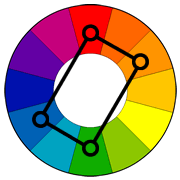
Rectangle (tetradic) color scheme
This rich color scheme offers plenty of possibilities for variation.
Tetradic color schemes works best if you let one color be dominant. You should also pay attention to the balance between w arm and cool colors in your design.
Square color scheme
The square color scheme is similar to the rectangle, but with all four colors spaced evenly around the color circle.
Square color schemes works best if you let one color be dominant.
You should also pay attention to the balance between warm and cool colors in your design.
PREVIOUS ARTICLE: UNDERSTANDING COLOR


